Oberpollinger / Loyalty Programme Rebranding
The Challenge
Oberpollinger's loyalty programme sits as a sub-brand within the KaDeWe Group's broader brand architecture. An audit revealed the member base skewed toward an older, shrinking demographic, while acquisition of younger customers had stalled — the identity no longer reflected who Oberpollinger needed to become.


The Framework
We mapped the brand against the Unilever Brand Key, mapping essence, values, personality, benefits, and discriminator against the group's positioning and against comparable luxury and lifestyle loyalty programmes. The functional benefits held up; the emotional ones didn't — the personality read as reserved and transactional, not aspirational.
- 75%Members over 55
- 20%Members 35–54
- 5%Members under 35 — the gap
The Strategic Choice
Rather than compete as another members' club, we found a Blue Ocean between two categories: the exclusive members' club (aspirational but cold) and the hyped, urban shopping/food destination (accessible but generic). We repositioned toward the space between, targeting Gen Z and young Millennials in the Consumer-Hedonist SINUS-Milieu. The brand personality was recalibrated accordingly: warmer, more playful, visually bolder, without diluting the premium cue.
The Execution
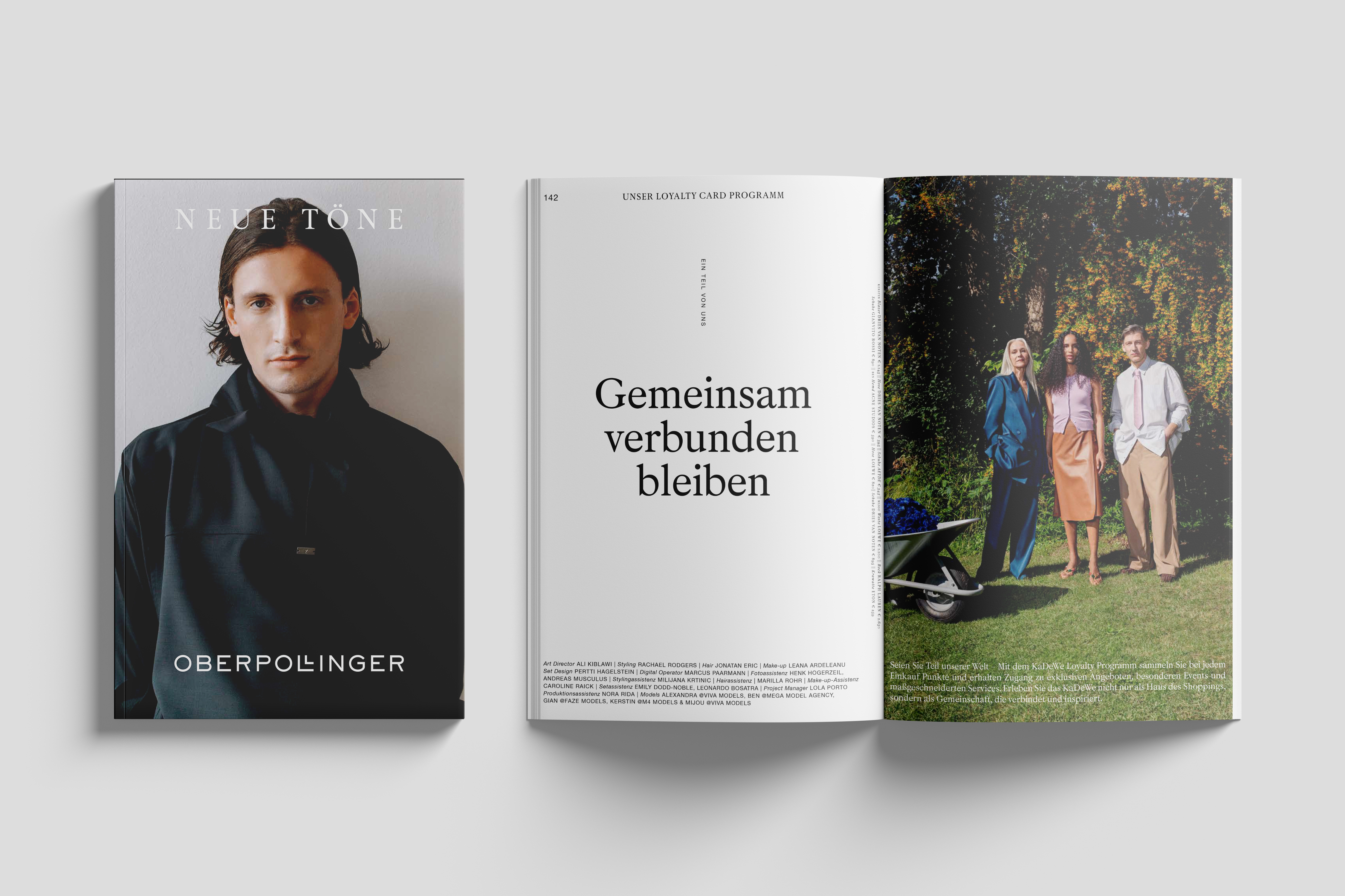
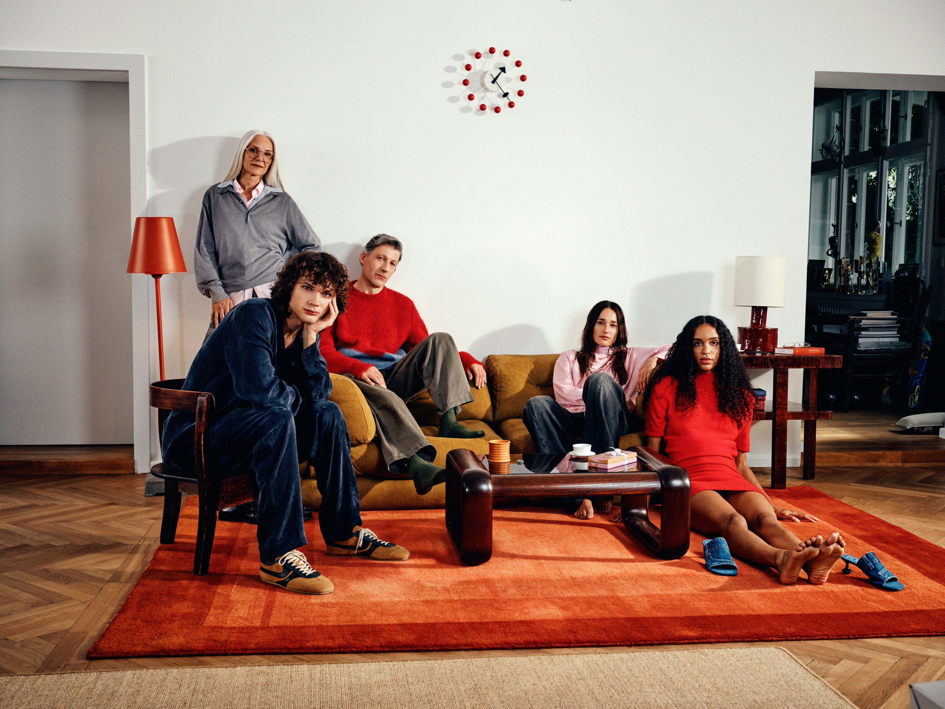
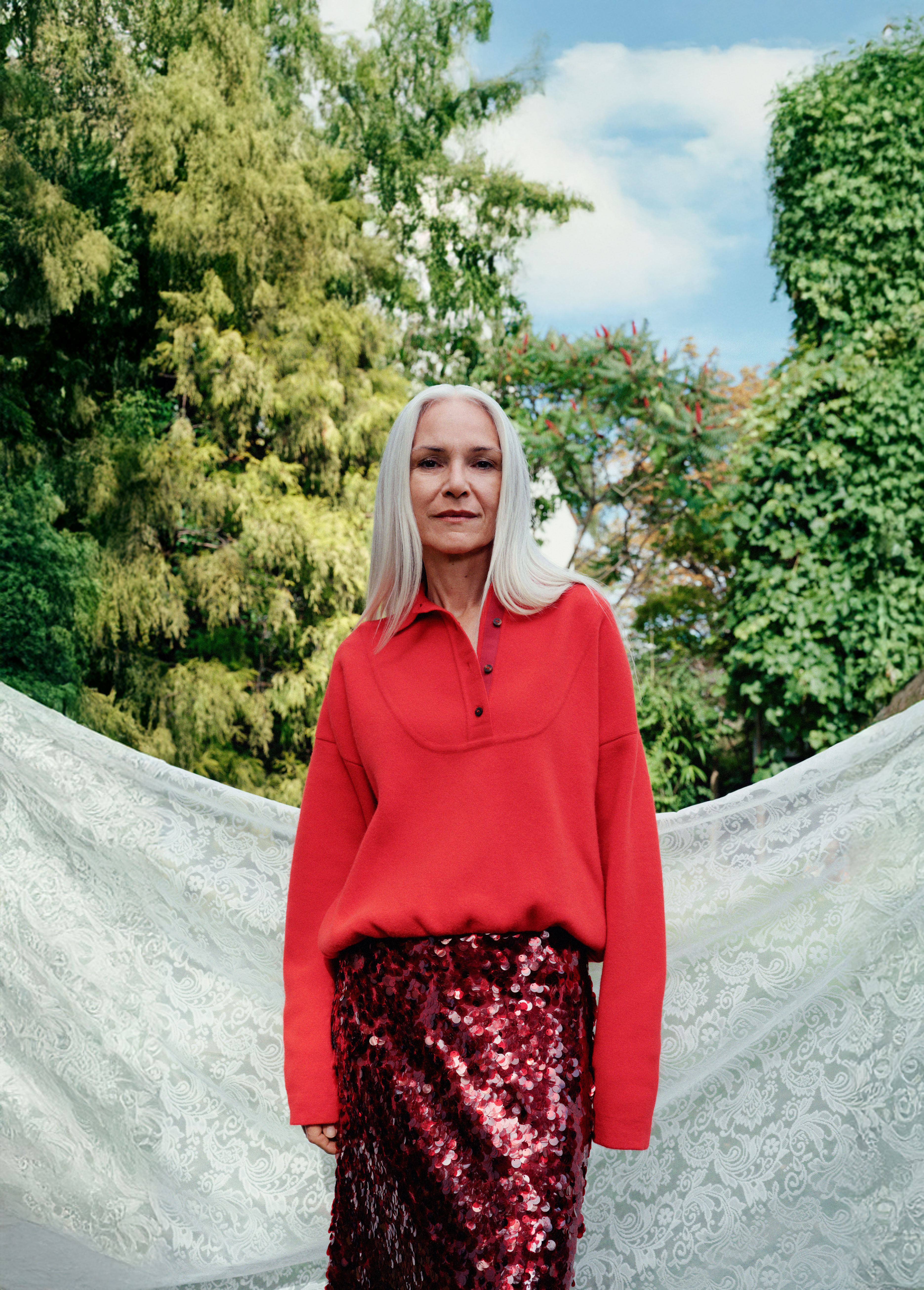
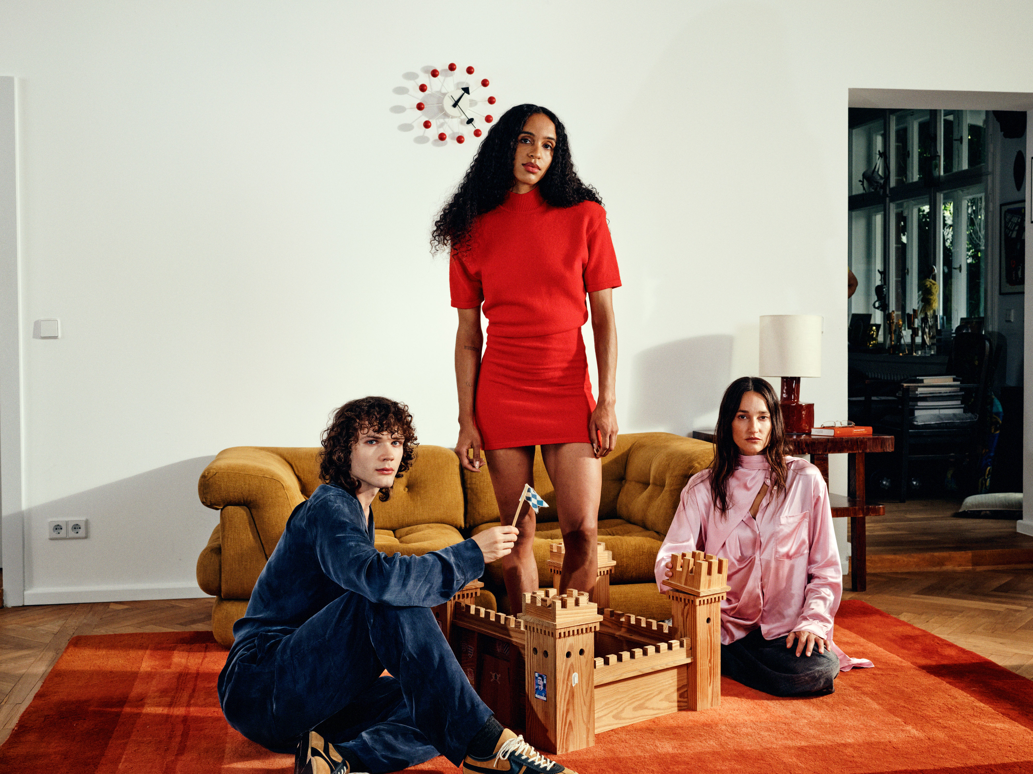
The repositioning was expressed through a new visual and verbal identity system, launched via a glossy campaign spanning motion, print, and in-store touchpoints — casting a diverse set of protagonists to signal the shift from "customer" to "community."
The Result
Q1 post-launch: +7.9% new member sign-ups.